Creating a JavaScript Multiple Areas Chart with LightningChart JS

For my second article in Hashnode, I will create a Multiple Areas Chart using Node JS and Lightning Chart JS. The finished project can always be downloaded separately, and you can freely use and customize it.
You may see that a Multiple Area chart shares similarities with a common line chart. In the case of the Multiple Areas chart, the bottom part of the plot is filled with a color or texture that represents an area size given the data amount. This can be represented on the chart in two or even three dimensions.
The Multiple Areas charts help view historical values and changes throughout one or several series of values. Multiple Areas charts can show trends and not just a specific value. Some good examples are when visualizing the growth of social network users or a website's performance during a period.
A Multiple Areas chart is useful to visualize cumulative data over time. The Multiple Areas chart supports visualization of data from several categories and allows comparing the relationship between each other.
An interesting aspect of the Multiple Areas chart is the color-filled areas that represent the volume or amount of data visualized, the size of the plot is proportional to the value of the data (as previously mentioned).
AboutLightningChart JS

If this is the first time you read about it, LightningChart JS is a JavaScript charting library focused on delivering the highest performance in the world of charting components. LightningChart JS features 2D and 3D components for developing different types of data applications for industries such as medical, engineering, science, motorsports, aerospace and defense, etc.
Project
This will be a simple project that you can later use freely in your personal (and non-commercial) projects. You can directly edit the interactive Multiple Areas chart example on LightningChart JS web editor.

Template Setup
To initialize the project, let's set up a working template or you can also download the project template (.ZIP) and follow along the tutorial.
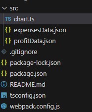
- After downloading the project template, you'll see a file tree like this one:
- Then open a new terminal and as usual in a Node JS project, run the
NPM Installcommand.
That'd be it, let's code.
Creating the chart
Today the most recent versions are LightningChart JS 5.1.0 and XYData 1.4.0. I recommend that you review the most recent versions and update them. This is because some LightningChart JS tools do not exist in previous versions.
In the project’s package.json file you can find the LightningChart JS dependencies:
"dependencies": {
"@arction/lcjs": "^5.1.0",
"@arction/xydata": "^1.4.0",
"webgl-obj-loader": "^2.0.8",
}
Importing libraries
We will start by importing the necessary libraries to create our chart.
const lcjs = require('@arction/lcjs')
import profitData from './profitData.json'
import expensesData from './expensesData.json'

// Extract required parts from LightningChartJS.
const { lightningChart, AreaSeriesTypes, UIElementBuilders, LegendBoxBuilders, PointShape, Themes } = lcjs
Add license key (free)
Once the LightningChart JS libraries are installed, we will import them into our chart.ts file. Note you will need atrial license, which is FREE (for personal non-commercial projects). We would then add it to a variable that will be used for creating the JavaScript Multiple Area chart object.
let license = undefined
try {
    license = 'xxxxxxxxxxxxx'
} catch (e) {}
Properties
const chart = lightningChart({license: license})
.ChartXY({
theme: Themes.cyberSpace,
})
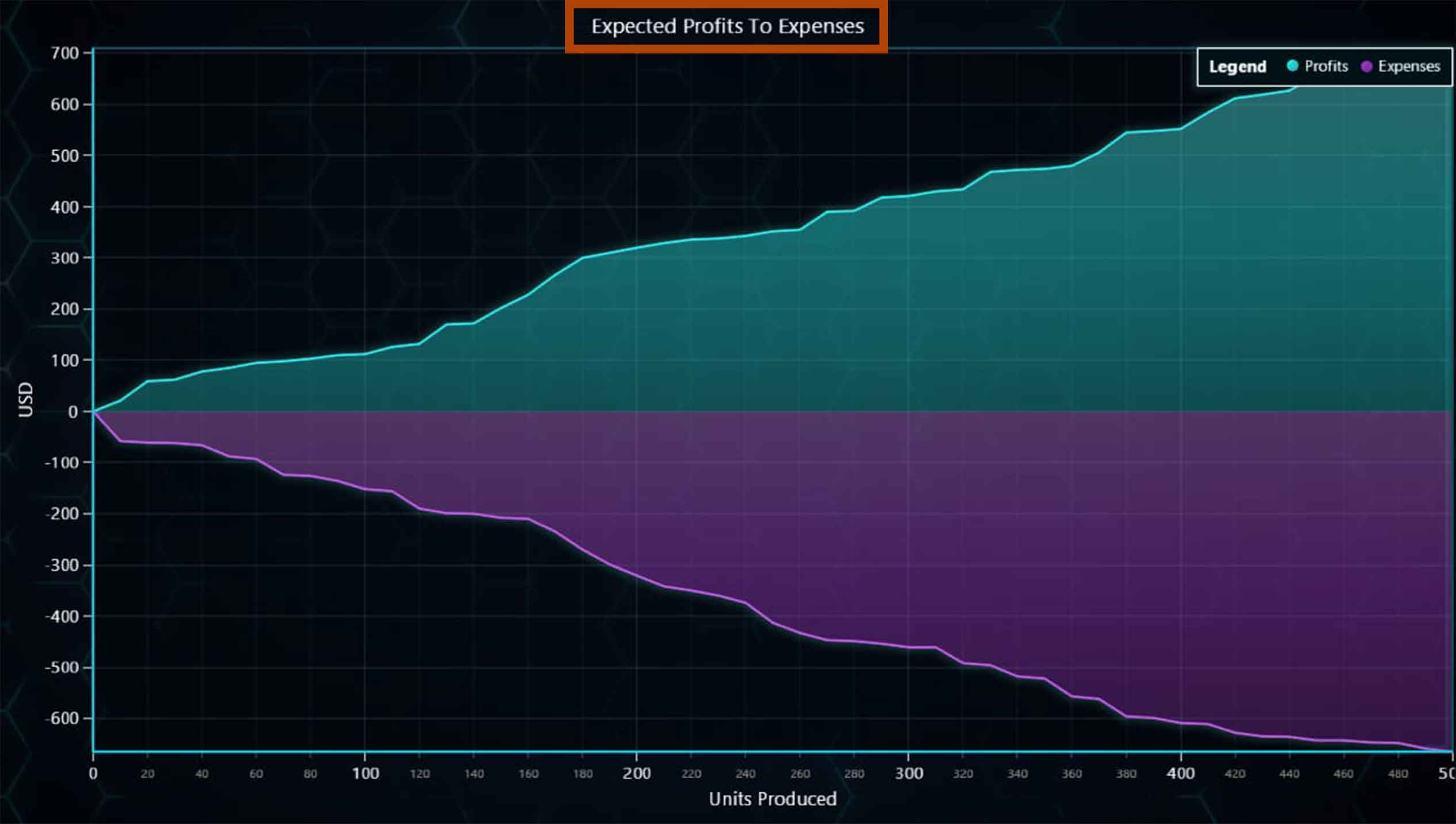
.setTitle('Expected Profits To Expenses')
.setPadding({ right: 2 })
Theme: defines the look and feel of your JavaScript stacked bar chart. Note that you must specify the color theme of the chart components beforehand.
setTitle: Sets the name at the top of the chart.
Adding legend box
The Legend Box will indicate the categories by color and hide the ones we want when we click them. The legend box can be added horizontally and vertically and is automatically removed when a condition is met, such as exceeding the maximum width relative to the chart size. This is useful when the chart resolution is too small or to free up memory when the chart is too large.
Here's an example of using LegendBox to hide data series within the chart.
Adding the data series
const areaProfit = xyChart.addAreaSeries({ type: AreaSeriesTypes.Positive }).setName('Profits')

const areaExpense = xyChart.addAreaSeries({ type: AreaSeriesTypes.Negative }).setName('Expenses')
addAreaSeries: this is a method for adding a new AreaSeries to the chart. This series type is used for visualizing areas between a static baseline and the supplied curve data. AreaSeries is optimized for processing large amounts of data.
Positive type: This type of AreaSeries only shows data above the baseline.
Negative Type: This type of AreaSeries only shows data below the baseline.
profitData.forEach((point) => {
    areaProfit.add(point)
})
expensesData.forEach((point) => {
    areaExpense.add(point)
})
Once the area series is created, we can add the data points stored in our JSON files. We just need to use the add function.
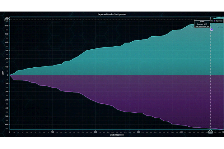
Creating cursor results table
The result cursor tables are the boxes that appear above the cursor when we position it on a coordinate of the chart. These tables can contain a specific format.
areaProfit.setCursorResultTableFormatter((builder, series, position, highValue, lowValue) => {
return builder
.addRow('Profits')
.addRow('Amount: $' + highValue.toFixed(0))
.addRow('Units Produced: ' + position.toFixed(0))
})
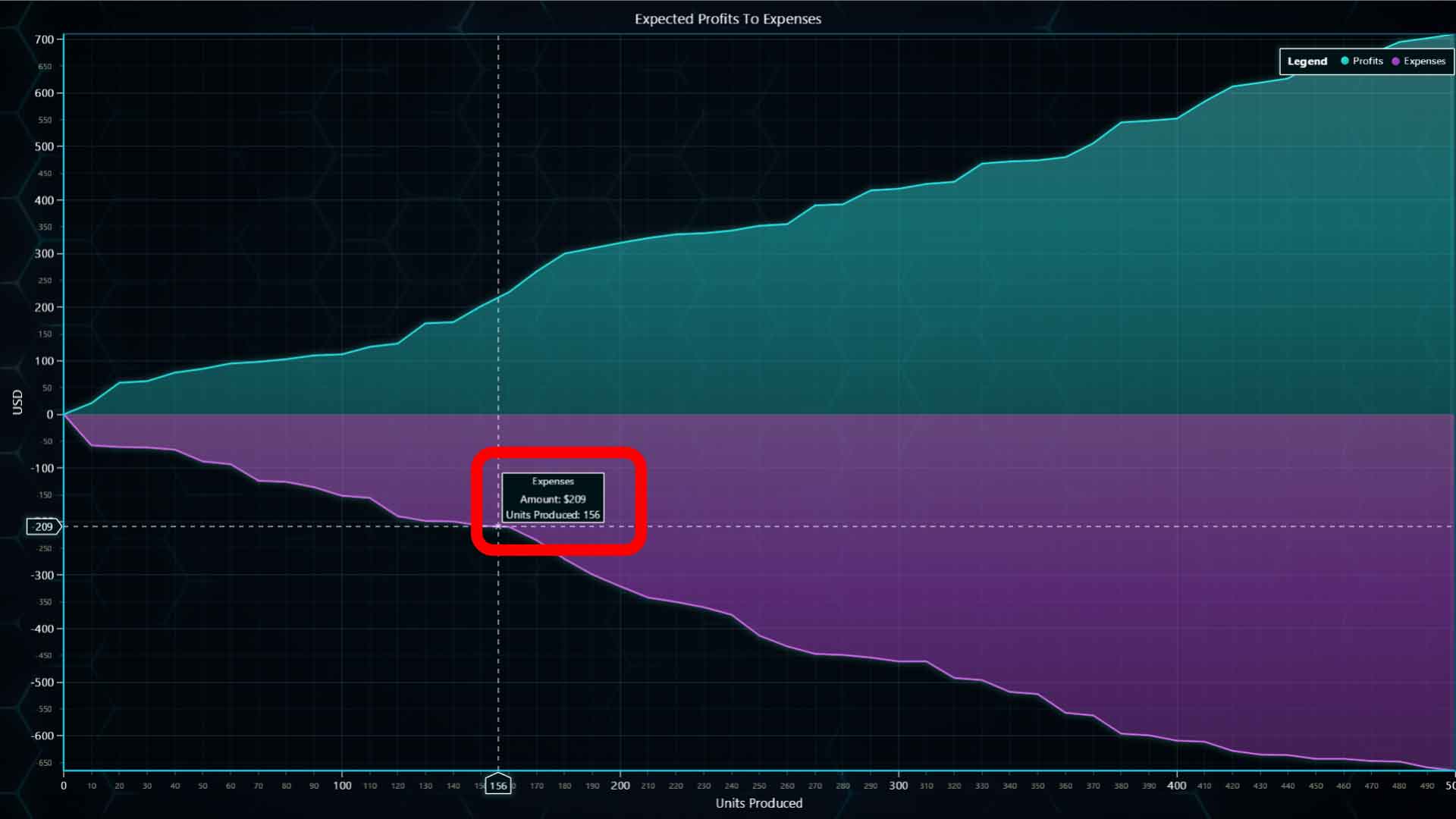
areaExpense.setCursorResultTableFormatter((builder, series, position, highValue, lowValue) => {
return builder
.addRow('Expenses')
.addRow('Amount: $' + highValue.toFixed(0) * -1)
.addRow('Units Produced: ' + position.toFixed(0))
})
- setCursorResultTableFormatter: Configure formatting of Cursor ResultTable when pointing at this series. The result table will be shown as a popup with the values we want to show. Each line is generated as a row (.addrow), and we can format it as we want with the text we need.
Adding series to LegendBox
legend.add(areaProfit, true, 'Expected Profits To Expenses', UIElementBuilders.CheckBox.setButtonShape(PointShape.Circle))
legend.add(areaExpense, true, 'Expected Profits To Expenses', UIElementBuilders.CheckBox.setButtonShape(PointShape.Circle))
We can add a dynamic value to LegendBox by creating a group and entries for it depending on the value type, support series, charts, and dashboards.
Parameters:
value: Attachable | Chart | Dashboard Series, Chart or Dashboard
options: LegendBoxAddOptions
Running the chart
To run the Multiple Areas chart, simply run the NPM START command. In the terminal, you will see a link to your local server where you can visualize the chart application. Local server is usually HTTP://localhost:8080/
Conclusion
As we saw, Multiple Areas charts can be used for comparing data over time. LightningChart JS is a library that makes it easy to implement this chart type within data applications.
This template works as an initial implementation, and you would only have to worry about generating your data and formatting it to be displayed in the chart.
I recommend experimenting with the different themes to adapt the chart to the type of report you want to display.
Written by Omar Urbano
Got stuck and need help? Reach out to me on LinkedIn


